
Yusuf Alper
Üye
- Kayıt
- 15 Kasım 2008
- Mesaj
- 321
- Tepki
- 10
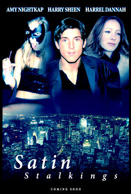
Start off with a new document. You’re going to find out that making a movie style design is much easier than you thought. You just need the proper training. It would also help to interact with this original 'movie poster' .psd design which you can get from the iPSDirectory or by signing up for the PSDer.

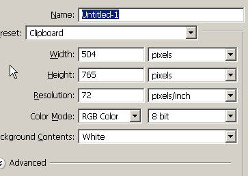
Press Next to continue with this (one sheet) movie poster design tutorial.
Now you can drag the actor into the design. Make sure to save the changes in that file if you want to keep the work path (saved selection). It’s a great idea if you know you might be using it again in the future so you don’t have to redo complicated or even simple selections.
If you didn’t use Match Color to start with to get each layer on the same level (and then do your color balancing) you may have to do further custom adjustments. Ctrl click on the layer icon of the layer you will further adjustment and then bring up another color balance adjustment layer. This will now apply only to the selected area on the layer you have selected. Adjust the sliders to balance out the adjustment so this layer looks more like the rest of the actors.
With color balance, many different options will usually work (ie. towards yellow, towards night blue)..it’s all up to you.

Fill your background layer with black.
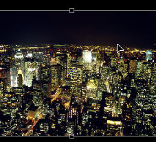
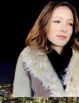
For this design I’m pulling in a nice cityscape scene from my Photos.com collection. Find something similar and drag it in with the moVe tool. Ctrl T Shift to scale it down to size...we want it to fill about a third of the space and towards the bottom.
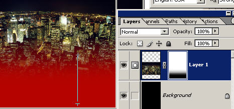
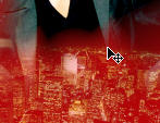
Use the layer masking technique to get rid of the harsh edges so you’ve got a nice blend. We want the black fading into black. This works well on many a movie poster.
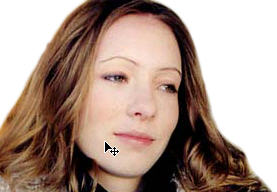
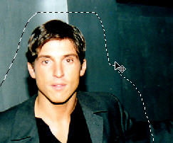
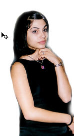
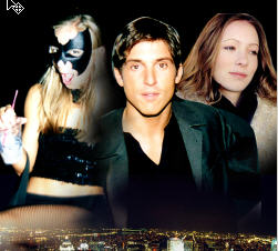
Now, grab some selections of your actors and actresses. These are from the 2,000 Images Bonus CD in my PSDesigner Package. Make your selection and pull them into the design with the move tool.
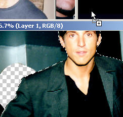
Once again, the art of the selection is an important study and in most designs you must have perfect selections. Here I’m using the quick mask mode with a brush to deselect the areas outside of the ‘actor’.
This technique is covered intensively in the Basic Photoshop DVD Training (included in the Discover Photoshop: Total Package with my PSDesigner training). You could also use the Extract tool, lasso, etc.
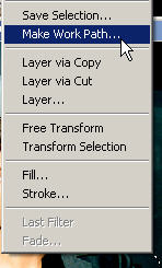
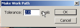
One thing you could also do is to make a work path to save a selection. Just right click after you’ve made your selection (still with the lasso or marquee tool) and choose Make Work Path.
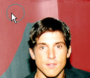
Press ok for the tolerance.
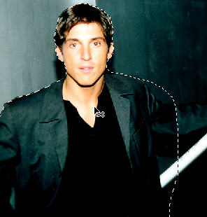
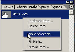
You can now see your new path in the paths palette. Click on it and Make Selection. This simply allows you to store your selection (you could also use Select:Save Selection) and come back to it when you want.
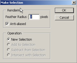
Press OK to not use a feather with the default at 0. Feathering adds a softer edge.
Press Next to continue with this (one sheet) movie poster design tutorial.
Now you can drag the actor into the design. Make sure to save the changes in that file if you want to keep the work path (saved selection). It’s a great idea if you know you might be using it again in the future so you don’t have to redo complicated or even simple selections.
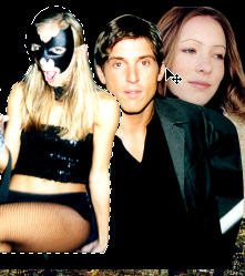
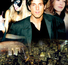
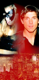
Do the same process again...find some more actors or characters that you think would fit well into your movie poster design. This isn’t the perfect mix but it’s intriguing enough.
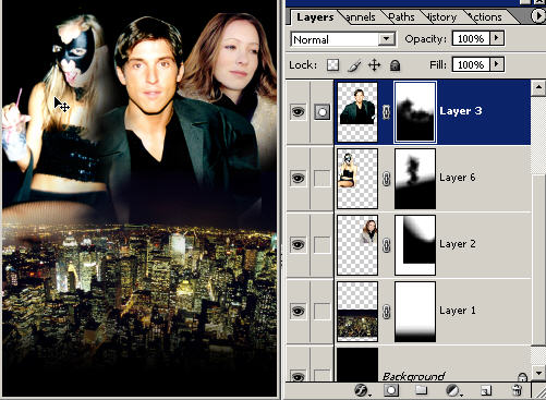
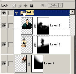
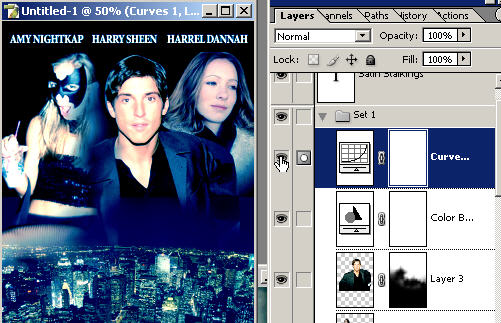
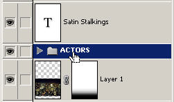
It’s important to understand layer order. You can change the order of these layers in the layers palette so they can be on top of or beneath each other. When you have a layer selected in the layers palette with the moVe tool, you can move it around anywhere on the document. To truly be a great designer you must master layers. Fortunately it’s one of the more simple areas to grasp. Take a look at the layer order here. You can obviously tell that the main character is in the center and on top of the other two layers in the layer palette.
It’s important to understand layer order. You can change the order of these layers in the layers palette so they can be on top of or beneath each other. When you have a layer selected in the layers palette with the moVe tool, you can move it around anywhere on the document. To truly be a great designer you must master layers. Fortunately it’s one of the more simple areas to grasp. Take a look at the layer order here. You can obviously tell that the main character is in the center and on top of the other two layers in the layer palette.
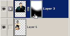
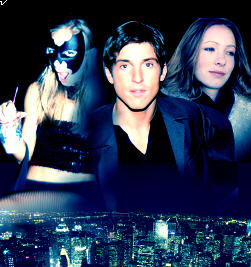
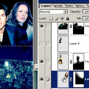
Create a layer mask on each of these layers (one at a time) and go ahead and use the gradient tool to get rid of any harsh edges. I’ll say it again and again...get used to this because it’s about the most powerful feature you’ll ever learn. The layer mask with gradient tool is hands down my favorite Photoshop feature and it’s used religiously in many genres of graphic design. Obi-wan has taught you well my son. Become the master apprentice with my full PSDesigner training.
To see your layer masking in action (gradient tool with black foreground) you can toggle the rubylith on and off (located on it’s own channel in the layers palette) by pressing the “|\” key. Red is the default rubylith color (which you can change) and it just shows your masked/hidden pixels on that layer. Here you can see I’m making short swipes with the diamond gradient to create a shadowmasking effect because of the blackground. This is done a lot in plenty of movie posters. It’s a simple and elegant effect that you can easily recreate. Black is a nice color that I think gives you a headstart right away on a design. Combine that with my gradient layer masking and strong source material and you can go places very fast! Even if you’re new in Photoshop.
Here in the layers palette you can see the layer masks. White stands for the untouched and original pixels and black and grey represent the areas that have been hidden on that layer.
YES you can also use the brush tool for layer masking but I only use it in special circumstances. I have learned to master the gradient tool because it is so much more effective and professional for creating perfect blends. Get used to using each of the different gradient tools. Which one depends on your situation.
YES you can also use the brush tool for layer masking but I only use it in special circumstances. I have learned to master the gradient tool because it is so much more effective and professional for creating perfect blends. Get used to using each of the different gradient tools. Which one depends on your situation.
I’ll use the linear gradient tool to immediately get rid of original photo edge lines and also for example the radial to get in and do spot masking. Even a soft brush doesn’t give you as perfect a result once you master the radial gradient tool (that's what I think).
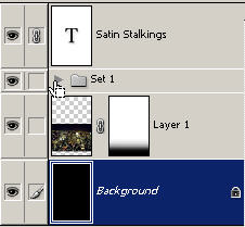
Create a new layer set by clicking on the layer set icon on the bottom of the layers palette. Now drag these layers into the layer set folder for organizational purposes.
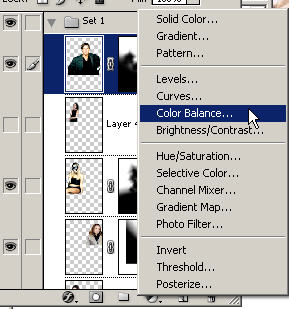
Make sure the top layer in this set is selected in the layers palette (the main actor). Now go to the adjustment/fill layer icon on the middle bottom of the layers palette and choose color balance. This will create a color balance layer that applies to all of the visible layers beneath it. You could also create custom adjustment layers for each layer or (follow me if you can) duplicate each of the 3 actor layers, link the new copies together, Layer: Merge Linked or Ctrl E and Ctrl Click on the layer icon and then create a custom adjustment layer. The problem is you can’t move them around then. With the other method you would have to create individual adjustment layers but this is OK because good design should at least take a few minutes! You’ll probably have to balance the color out on each layer separately to get them all similar. In CS you could use Match color to start off.
You could also mask global adjustment layers if you don’t want them to apply to particular areas or other layers of the design. Ok, here is beyond basic Photoshop hehe..
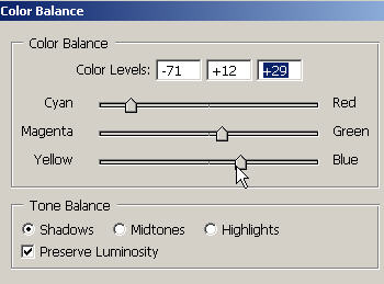
Changing the color balance is a technique that is used all of the time in making one sheets (movie posters). Generally we want all of our actors to be color balanced to one shade. This starts creating a nice poster feel to it. You could also use a Hue adjustment on colorize but this is sometimes too much color. In color balance you can adjustment the shadows, midtones and highlights separately.
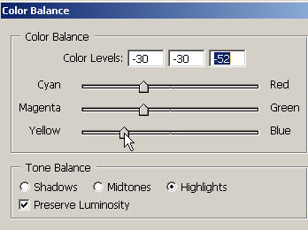
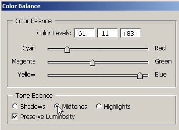
If you didn’t use Match Color to start with to get each layer on the same level (and then do your color balancing) you may have to do further custom adjustments. Ctrl click on the layer icon of the layer you will further adjustment and then bring up another color balance adjustment layer. This will now apply only to the selected area on the layer you have selected. Adjust the sliders to balance out the adjustment so this layer looks more like the rest of the actors.
With color balance, many different options will usually work (ie. towards yellow, towards night blue)..it’s all up to you.
Adjust the color balance to your preferences. You should have a feel for the look you’re going for or know right away that something looks good. It’s ok to be subtle. Here is the before and after (clicking on and off the color balance adjustment layer icon).
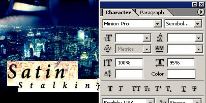
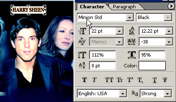
Here you would add some Text with your type tool. Think about text as something that would synergize and complement the entire design. You can get this design from the iPSDirectory or by signing up for the PSDer ezine. To get 100 free downloads from my new website go here.
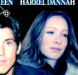
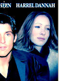
This being a movie style poster, you will want to create your fantasy names or real names) at the top of the design. Use a smaller font. You definitely want these to be legible and there are a few fonts that will work all of the time like Minion and TNRoman...
You may have to move the layer up in the layers palette because when you create new layers or start entering text, it will be placed right above the layer that you were on. Press Ctrl/Cmd when you click new layer icon to put a new layer below the currently highlighted layer.
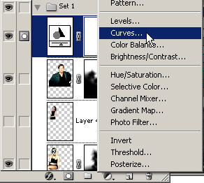
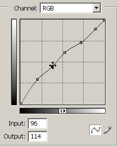
Here I’m just creating a Curves adjustment layer. You can use Curves to get some wild and instant light effects. Curves maps the light in different ways and levels across the layer.
Here is that custom adjustment layer that I talked about. Do this to further balance out the image if there is off coloring. (And there still will be but I'm just spending a few minutes on this design).
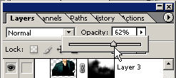
Now the layer is less harsh red and more blue. Just making little adjustments like this can easily help improve an image. You can also lower the opacity to let it blend a little with the original layer below. Remember that you have an arsenal of tools at your disposal. You can hear Photoshop saying “use me” or “what’s my name”..
Sort your layers I mean actors into a layer set.
FF TAB to view the product in full screen. No I didn’t plan this out, I made it up as we went along while recording the tutorial. But you’ll find that once you master certain basic techniques and open your mind with simple principles such as I’ve covered here...the possibilities are endless. When you start combining all of the powerful tools and options together with your vision, based on what you know works, inspiration from other sources and from your own vision it gets VERY exciting because you realize how unlimited it is what you could actually produce.
Understand techniques like these as a basis, so you can get into a flow and apply your visions and always be asking yourself how can I improve upon this. Make it a state of mind. And combined with a solid base knowledge of Photoshop and some kick-arse tutorials like these you ought to be having a field day with your Photoshop. Remember also that the stronger your source material is, the greater the sum of the whole will be.
I mean all I had to do was pull in a great Photos.com image on a black background and we’re already way ahead of people who puts around with all kinds of things getting nowhere for hours. KNOWLEDGE=POWER. Go here to check out some advanced graphic design tutorials such as fashion and product advertising design.
NOT: Ders anlatım ingilizce de olsa konu anlaşılıyor neticede resimli anlatım umarım faydalı olur.